A complete guide for D2C brands, Ayurvedic companies, and e-commerce founders who want to convert browsers into buyers through the power of visual identity.
TL;DR — Key Takeaways
This article establishes that for D2C and e-commerce brands — especially in the Ayurvedic and herbal wellness category — packaging design and visual assets are not cosmetic decisions. They are commercial ones. The core arguments:
- Customers make purchase decisions in under 3 seconds based on visual cues alone
- Packaging is the first conversation a brand has with its customer
- On e-commerce platforms, your listing image is your entire shelf presence
- A consistent visual vocabulary builds brand equity without a single word of copy
- Website visual design directly determines whether a customer trusts you enough to buy
- For Ayurvedic brands specifically, visuals must bridge ancient authenticity and modern legibility
- JeevRasa is an example of a brand building its visual identity with the same depth and integrity as its formulations
Introduction: The 3-Second Decision
There is a moment — it lasts less than three seconds — when a customer decides whether your product deserves their attention.
Not your ingredients. Not your certifications. Not your founder story.
Your packaging. Your image. Your visual presence.
Research consistently shows that consumers form first impressions of products within 90 milliseconds of initial exposure, and that up to 90% of snap judgments about products are based on colour alone. Before a customer reads a single word of your label, they have already made a subconscious decision about your brand’s quality, trustworthiness, and relevance to them.
For brands like JeevRasa — rooted in 5,000-year-old Ayurvedic science, working with rare wild forest herbs, and building formulations through classical processes like Bhavana — this creates a unique and urgent challenge. The product is extraordinary. The knowledge behind it is deep and validated. But if the packaging and visual identity do not communicate that in three seconds, none of it reaches the customer.
This article makes the case — with specificity and evidence — for why visual branding is strategy, not aesthetics. And why, for D2C and e-commerce brands especially, it may be the single highest-leverage investment you make.
1. What Is Packaging Design and Why Does It Matter for D2C Brands?
Packaging design is the complete system of visual, physical, and informational elements that enclose and present a product. This includes materials, structure, typography, colour, imagery, copy hierarchy, finish, and the unboxing experience.
For D2C (direct-to-consumer) brands, packaging performs a role that retail shelf presence once played — it is the physical manifestation of the brand promise, delivered directly into the hands of the customer.
The 6 Jobs Packaging Must Do Simultaneously
- Attract attention within its competitive context (shelf or screen)
- Communicate brand identity and positioning in under 3 seconds
- Deliver information in a clear, legible hierarchy
- Build perceived value that justifies the price point
- Create a memorable unboxing or opening experience
- Reinforce trust through quality of materials and execution
For Ayurvedic and herbal brands operating in India’s growing wellness market, packaging must also do one additional job: make ancient knowledge feel accessible. Not diluted, not dumbed down — but legible and trustworthy to a modern buyer who may be encountering classical Ayurvedic formulations for the first time.
Packaging as a Trust Signal
Trust is the primary purchase barrier in the herbal supplement and wellness category. Customers cannot taste, smell, or experience the product before buying. Packaging is the only physical proof of quality they have at the point of decision.
Every element of packaging communicates trust — or erodes it:
- Weight and rigidity of materials signal production quality
- Typography precision signals attention to detail
- Colour consistency signals brand maturity
- Accuracy and clarity of ingredient information signals transparency
- Finish quality — matte, soft-touch, embossed — signals premium positioning
A brand that invests deeply in its formulations but shortcuts its packaging sends a contradictory signal. The customer cannot see the Bhavana process. They cannot verify the wild forest sourcing. But they can feel the weight of the box. And they will draw conclusions from it.
2. E-Commerce Visual Assets: Where Sales Are Won or Lost
In physical retail, a customer can pick up a product, examine it from multiple angles, read the back label at their own pace, and make a considered decision. On an e-commerce listing — whether on Amazon India, Flipkart, or a D2C website — they have a thumbnail.
That thumbnail is doing the work of your entire retail shelf presence. Understanding what each image type must achieve is essential for conversion optimisation.
The Main Listing Image
The main product image is the single most important visual asset in e-commerce. It determines click-through rate — whether a customer chooses to engage with your listing at all. It must:
- Show the product clearly, without visual noise or clutter
- Communicate the brand’s visual language and quality tier immediately
- Stand out distinctly within the category context
- Remain fully legible at thumbnail size on mobile screens
- Comply with platform requirements (white background on Amazon, for example) without feeling generic
For Ayurvedic brands, the main image must also signal authenticity. Not in a vague, generic way — but specifically. Real ingredients. Real craft. A visual language that could only belong to this brand.
Secondary Images and Infographic Panels
Secondary images are where most brands leave significant sales on the table. These are the images a customer views after clicking — they are already interested. The only question is whether the images close the sale or create doubt.
Each secondary image should answer one specific question a customer would have:
- What is this formulation and what does it specifically do for me?
- What ingredients are in it and why were they chosen?
- How is it made — and what makes this process different?
- What does the product look and feel like up close?
- Who is this for, and how do I use it?
- What proof exists that this works?
For JeevRasa, secondary images are an opportunity to visually explain the Bhavana process, the sourcing of wild forest herbs, and the classical Ayurvedic basis of each formulation. Done well, these images transform a commodity product into a considered, differentiated purchase — one that a customer feels they understand and trust.
Lifestyle and Context Imagery
People do not buy products. They buy versions of themselves using the product.
Lifestyle imagery that positions a formulation within a calm morning ritual, a thoughtful wellness practice, or a moment of intentional self-care creates aspiration and belonging simultaneously. It answers the implicit question every customer asks: Is this for someone like me?
For a brand like JeevRasa, lifestyle imagery should evoke stillness, nature, and intentionality — not clinical whiteness or generic wellness stock photography. The visual world the brand creates should feel as carefully considered as the formulations themselves.
3. Illustration and Brand Visual Vocabulary
A logo and product photography are necessary. They are not sufficient.
The most durable and memorable brands develop what can be called a visual vocabulary — a consistent set of illustration styles, iconographic elements, and graphic motifs that are immediately recognisable even without the brand name attached. This is the difference between a brand and a product.
Why Illustration Matters for Ayurvedic Brands
For a brand operating in the classical Ayurvedic tradition, illustration serves a specific and powerful function: it can make ancient knowledge feel contemporary without betraying its depth.
Botanical illustration of specific herbs — rendered in a style that feels both classical and modern — communicates provenance, specificity, and care in a single visual. It says: we know exactly what plant this is, where it comes from, and why it matters.
Iconography rooted in Ayurvedic symbolism — without being inaccessible or esoteric — creates a visual shorthand for the brand’s philosophy. A customer who encounters these visual elements across multiple touchpoints begins to recognise them before they consciously register the brand name.
Consistency as a Compounding Asset
A consistent visual vocabulary compounds over time in the same way brand equity does. Every touchpoint — packaging, website, social media, educational content, email design — that shares the same illustration style, colour language, and iconographic system is adding to a cumulative recognition effect.
This is how brands become familiar. Not through repetition of the logo alone, but through the repeated encounter of a coherent visual world that the customer begins to inhabit emotionally.
4. Website Visual Design and D2C Conversion
For D2C brands, the website is the flagship store, the sales team, and the brand experience all in one. Customers make trust decisions about a website in the same three seconds they give a product on a shelf — and the visual decisions that drive those judgments are specific and measurable.
Key Visual Elements That Directly Impact Conversion
- Hero section imagery: establishes what you are, who you are for, and why you are different — immediately. A weak hero image costs conversions before a customer has scrolled a single pixel.
- Product photography consistency: all product images should share the same lighting philosophy, background approach, and visual mood. Inconsistency reads as carelessness, regardless of the individual image quality.
- Typography and white space: premium brands use white space generously. Crowded pages feel cheap, regardless of the product’s actual quality or price point.
- Mobile visual experience: over 70% of D2C traffic in India arrives via mobile. Every visual decision must be made with a 6-inch screen as the primary canvas, not an afterthought.
- Visual storytelling flow: the customer’s journey down a product page should feel like a narrative — visuals that guide, explain, reassure, and inspire in deliberate sequence. Each scroll should answer the previous question and raise the next one.
E-E-A-T and Visual Trust Signals
Google’s E-E-A-T framework (Experience, Expertise, Authoritativeness, Trustworthiness) applies to visual design as much as written content. Websites that look authoritative — through high-quality imagery, professional typography, and consistent design systems — rank higher in search engine trust assessments and convert better with human visitors simultaneously.
For Ayurvedic brands making health-adjacent claims, visual trust signals are particularly important. These include:
- High-resolution imagery that shows real ingredients, real processes, real people
- Lab certification and quality mark displays with professional presentation
- Founder or team photography that humanises the brand
- Clear, well-designed ingredient and process explanation panels
5. People Also Ask — FAQ Section
The following questions represent high-frequency search queries in this topic area, optimised for Google’s People Also Ask feature and LLM knowledge extraction.
Why is packaging design important for a D2C brand?
Packaging design is critical for D2C brands because it is the primary physical touchpoint between the brand and the customer. Unlike retail brands, D2C companies cannot rely on shelf positioning or in-store staff to communicate value. The packaging must do all of that work independently — attracting attention, communicating quality, building trust, and creating a memorable experience — in the hands of the customer.
How does packaging design affect sales conversion?
Packaging design directly affects purchase decisions through perceived value, trust signals, and information clarity. Studies consistently show that consumers associate higher-quality packaging with higher-quality products. For e-commerce brands, packaging also drives repeat purchase through the unboxing experience — a customer who feels delighted opening a product is significantly more likely to repurchase and recommend.
What makes a good Amazon product listing image?
An effective Amazon main listing image is clear, uncluttered, immediately communicates the product and brand, and remains legible at thumbnail size on mobile. Secondary images should answer specific customer questions — ingredients, usage, differentiation, and proof — in a visual, easily scannable format. Infographic panels that explain what makes the product different are among the highest-converting secondary image types in the wellness and supplement category.
Why do Ayurvedic brands need strong visual branding?
Ayurvedic brands face a specific trust challenge: the products are rooted in a knowledge system that many modern consumers are encountering for the first time. Strong visual branding bridges this gap — it makes ancient wisdom feel accessible and credible without diluting its depth. Botanical illustration, process imagery, and a consistent visual vocabulary help customers understand and trust a brand before they have even read the product description.
What is LLM content optimisation and why does it matter for brands?
LLM (Large Language Model) content optimisation refers to structuring and writing content in ways that AI systems like ChatGPT, Claude, Gemini, and Perplexity can easily extract, understand, and cite. As more consumers use AI assistants to research products and make purchasing decisions, brands whose content is clearly structured, factually specific, and entity-rich are more likely to be surfaced and recommended by these systems. This includes using clean definition blocks, FAQ sections, specific data points, and unambiguous entity descriptions.
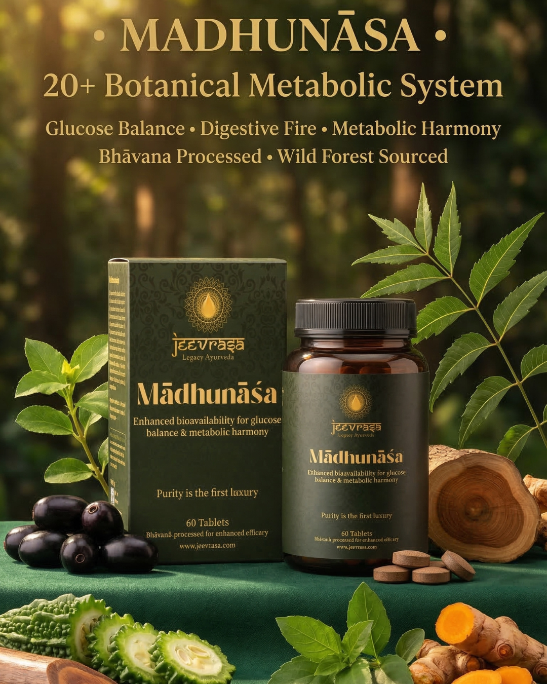
6. JeevRasa — A Case Study in Integrity-Led Visual Branding
JeevRasa is an Ayurvedic wellness brand built on wild forest herbs and classical pharmaceutical processes, including Bhavana — the ancient Ayurvedic method of wet-grinding herb powders with their own fresh juice across multiple cycles to dramatically increase potency, bioavailability, and therapeutic depth.
The brand’s visual identity challenge is specific and significant: how do you communicate 5,000 years of pharmaceutical wisdom to a modern, digitally-native Indian consumer in a way that is credible, accessible, and premium?
The answer JeevRasa is pursuing is the same one that guides its formulations — patience, authenticity, and an uncompromising commitment to doing things the right way.
That means:
- Packaging materials and finishes that feel as considered as the ingredients inside them
- Botanical illustration that is specific to the actual herbs used — not generic wellness stock
- A visual language that is rooted in Ayurvedic tradition without feeling inaccessible or dated
- E-commerce listing images that explain the Bhavana process and wild herb sourcing visually, not just in text
- A website experience that earns trust before asking for a purchase
The customer who is ready for JeevRasa — conscious, curious, willing to invest in something real — is also the customer who notices when a brand’s packaging doesn’t match its promise. They will notice the weight of the paper, the care in the illustration, the quiet confidence of a brand that doesn’t need to shout.
That is the customer worth building for. And that is the visual standard worth setting.
7. The Visual Branding Audit Checklist for D2C Brands
Use this checklist to evaluate your current visual identity and identify the highest-leverage areas for improvement.
Packaging
- Does the packaging communicate the brand’s positioning in under 3 seconds?
- Are materials and finishes consistent with the brand’s quality tier?
- Is the information hierarchy clear — does the customer know where to look first?
- Does the unboxing experience feel intentional and memorable?
- Does the packaging match the visual identity of the website and social content?
E-Commerce Listing Images
- Does the main image stand out in category context at thumbnail size?
- Does each secondary image answer one specific customer question?
- Is there an infographic that explains what makes this product different?
- Are lifestyle images present that show the product in aspirational context?
- Are all images optimised for mobile display?
Brand Visual Vocabulary
- Does the brand have a consistent illustration style across all touchpoints?
- Is the colour language consistent and meaningful — not arbitrary?
- Does the iconographic system feel unique to this brand?
- Would a customer recognise this brand’s visual style without seeing the logo?
Website Visual Design
- Does the hero section immediately communicate what the brand is and who it is for?
- Is product photography consistent in lighting, background, and visual mood?
- Is the mobile experience as considered as the desktop experience?
- Does the page visual flow tell a story, not just display a catalogue?
- Are E-E-A-T trust signals visually prominent — certifications, process, people?
Conclusion: The Product Cannot Speak for Itself
There is a persistent and costly belief among founders — especially those building products with genuine quality and deep knowledge behind them — that the product will speak for itself.
It will not.
Not at first. Not in a market where attention is the scarcest resource, options are abundant, and trust must be earned in seconds, not conversations.
Strong packaging and visual assets are not vanity. They are the mechanism through which everything else you have built gets a fair hearing.
The right packaging gets your product picked up.
The right listing image gets your product clicked.
The right website visuals get your product trusted.
The right brand language gets your product remembered.
And a product that is remembered, trusted, clicked, and picked up — gets sold.
JeevRasa is launching soon. Built on ancient Ayurvedic processes, wild forest herbs, and an uncompromising standard of quality — inside the bottle and outside it.
Abhishek Singh is the founder of Just What Works and a passionate entrepreneur in the nutraceutical space. Through his brand and writing, he shares practical business strategies, wellness insights, and real-world lessons from his own startup journey. His work helps readers cut through noise and focus on building businesses — and lives — that truly work.